


Gold accents can make a party table feel polished and warm. But if you use too much, things start to look heavy and distracting.
You want the shine to support the table, not take it over. The right balance helps every detail feel calm, clean, and planned.
You use gold accents without overdoing it by treating gold as a highlight, keeping it limited, and pairing it with simple colors, soft textures, and clear layers. This way, gold guides the eye while the table stays easy to enjoy.
This guide shows how to pick the right gold pieces and layer them with contrast. You’ll also see how small finishing touches matter and which common mistakes can easily throw off the balance.
Core Principles for Styling with Gold Accents
Gold works best when you use it with purpose and control. Strong table styling depends on knowing what gold adds, how much to use, and which finish fits the setting.
Understanding the Power of Gold in Table Decor
Gold accents draw attention fast. Treat them as highlights, not the base of your table design.
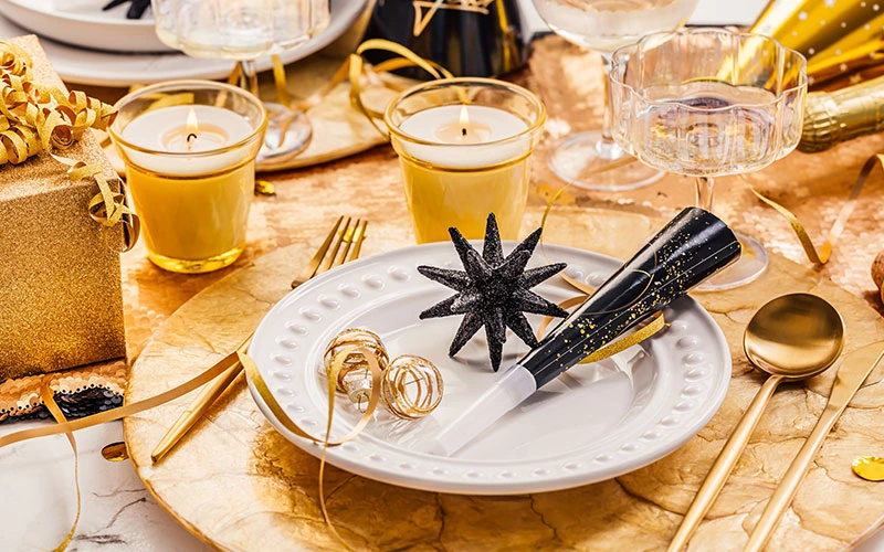
On party tables, gold decor works best when it supports the main color scheme instead of replacing it. Subtle gold reflects light and adds warmth. It helps candles glow and makes place settings feel more refined. Try gold on flatware edges, napkin rings, or charger plates to guide the eye without stealing focus.
Gold also signals formality. For a casual event, keep gold limited and low-shine. For formal dinners, you might use a bit more, but still with care and spacing.
Setting the Right Ratio: Balance and Restraint
Balance matters more than quantity. Limit gold accents to one or two item types per table to keep things clean and avoid visual clutter.
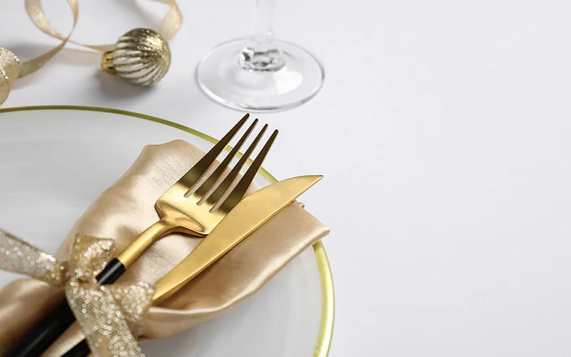
A simple rule helps:
| Table Element | Recommendation |
|---|---|
| Flatware | Gold or gold-accented, not paired with gold plates |
| Centerpieces | Neutral base with small gold details |
| Linens | Solid colors without metallic thread |
Spread gold evenly across the table. Don’t group all metallic finishes in one spot. When you space gold items apart, the table feels planned and calm instead of heavy.
Choosing the Appropriate Type of Gold Finish
Not all gold finishes create the same effect. The finish you pick sets the mood and controls how bold the gold appears.
● Brushed gold looks soft and controlled. It’s great for modern or relaxed parties.
● Polished gold feels formal and reflective. Use it in small doses for evening events.
● Muted or antique gold pairs well with natural textures like linen and wood.
Stick to one gold finish per table. Mixing too many tones can look messy fast.
Selecting Gold Accents for Party Tables
Gold works best when you use it with purpose. Focus on a few high-impact items, keep finishes consistent, and balance metallic accents with simple materials like glass, fabric, and greenery.
Gold Tableware and Utensils
Start with items guests touch and notice first. Gold-rimmed plates, gold flatware, or gold-accented glassware add polish without overloading the table with shine.
Choose one gold feature per place setting, not all three. For example, pair plain white plates with gold utensils, or use gold-rimmed glasses with standard flatware. This keeps the look clean and avoids clutter. Stick to one finish, like matte or brushed gold. Mixed finishes can clash and distract. If your table includes visible gold hardware, like chair details or serving tools, match the tone to your tableware for a steady look.
Gold Chargers, Placemats, and Napkin Rings
Chargers and placemats frame each place setting. Gold chargers work best when plates stay simple and neutral. Avoid patterns that compete with the metallic surface. Gold placemats made from woven or textured materials feel softer than mirror-finish metal and reduce glare under bright lights.
Keep napkin rings small and simple, especially when using folded fabric napkins. Use gold accents in this category sparingly.
Here’s a quick pairing guide:
| Item | Best Pairing |
|---|---|
| Gold charger | White or ivory plates |
| Gold placemat | Linen or cotton napkins |
| Gold napkin ring | Solid-color napkin |
Centerpieces and Decorative Accessories
Centerpieces should anchor the table, not dominate it. Choose one metallic centerpiece or a small group of gold pieces instead of scattering them everywhere.
A low gold tray with candles or greenery keeps sightlines clear. Gold vases, candle holders, or bowls work well when mixed with glass or ceramic pieces.
This contrast tones down the shine. Limit small gold accessories like place card holders or table numbers. When you use too many, the table feels busy. Try to keep gold in clear zones, not all over the place.
Creating Elegant Layering and Contrast
You create balance on party tables by controlling color, shine, and texture. Gold works best when you limit its role, pair it with calm surfaces, and support it with soft layers that add depth without clutter.
Pairing Gold with a Neutral Palette
A neutral palette keeps gold accents refined and easy to manage. Use white, cream, beige, soft gray, or matte black as the base for linens, plates, and napkins. These shades let gold stand out without feeling heavy.
Limit gold to small, clear touchpoints like flatware, napkin rings, or charger rims. Avoid using gold on large surfaces like full tablecloths or chair covers. That way, the table stays calm and readable.
Effective neutral and gold pairings:
| Neutral Base | Gold Accent Type |
| White linen | Brushed gold flatware |
| Gray runner | Gold-rim glassware |
| Black plates | Warm gold napkin rings |
Mixing Metals for Contemporary Balance
Mixing metals helps gold feel fresh and not too formal. You can pair gold and silver if you control the finish and placement.
Keep one metal dominant and use the other as a quiet accent. Choose similar tones, like brushed gold with satin silver. Avoid mixing shiny finishes with dull ones in the same area. That kind of contrast just feels off.
Place metals with intent. For example, use gold for flatware and silver for candle holders. This separation gives each metal a clear role and keeps the table organized.
Simple mixing rules:
● Limit to two metals.
● Match finishes, not colors.
● Repeat each metal at least twice.
Integrating Textiles and Gold Details
Textiles soften gold and help it blend into the table. Use napkins, runners, or placemats with subtle texture before adding metallic pieces.
This layering supports using metallics without excess shine. Look for fabrics with metallic thread or light gold embroidery.
These details add warmth without reflecting too much light. Keep patterns small and spacing wide so the gold reads as an accent, not decoration.
Balance textured textiles with smooth gold items. For example, pair a linen runner with simple gold candle holders.
This mix creates contrast while keeping the table clean and controlled.
Lighting and Reflective Elements for Party Tables
Lighting and reflective pieces shape how gold accents look on your table. When you control light and reflection, gold looks warm and refined instead of harsh or flashy.
Gold Candle Holders and Table Lamps
Gold candle holders work best when they’re simple in shape and size. Choose smooth or lightly brushed finishes to avoid glare.
Short holders keep sightlines clear and spread light evenly across the table. Gold table lamps add steady light when candles just aren’t enough.
Use lamps with soft fabric shades to diffuse light. Place one at a buffet or side table instead of in the center.
Pair warm white bulbs with gold finishes. Cool light makes gold look flat, but warm light helps reflect it gently and keeps the table calm.
Utilizing Gold Mirrors and Frames
Gold mirrors expand light and space when you place them with care. A small gold-framed mirror behind the table can reflect candles and centerpieces without drawing too much attention.
Avoid putting gold mirrors right across from strong light. That can create glare.
Angle them a bit to reflect light at a softer angle. Gold picture frames work well for table numbers or menus.
Keep frames thin and consistent in finish. Mixing too many frame styles breaks visual order and weakens the effect.
Leveraging Lighting to Reflect Gold Accents
Light placement matters more than the amount of gold you use. Use indirect lighting to reflect light off gold surfaces rather than shining directly on them.
A gold chandelier works best when it hangs above the table, not too low. It should frame the table and reflect light downward without overpowering the setting.
Here’s a quick guide to control reflection:
| Light Source | Best Use |
|---|---|
| Candles | Soft glow on gold accents |
| Table lamps | Even side lighting |
| Overhead light | Broad reflection without glare |
Finishing Touches with Gold Decor and Accessories
You can use small gold decor to add polish without crowding the table. Focus on pieces that serve a purpose and keep the finish consistent so the table feels planned, not busy.
Gold Trays, Vases, and Decorative Bowls
A gold tray works best when it groups items you already need on the table. Use it to hold place cards, folded napkins, or a small candle set. This keeps the table neat and gives the gold a clear role.
Choose vases and bowls with clean shapes. Avoid heavy patterns or bright shine. A soft brushed or satin gold blends better with dishes and linens.
Placement tips that work well:
● Use one gold tray per table, not one per setting
● Keep vases low so guests can see each other
● Leave open space around each gold piece
| Item | Best Use | Finish to Choose |
|---|---|---|
| Gold tray | Center or side of table | Brushed or matte |
| Gold vase | Single stem or greenery | Satin |
| Gold bowl | Wrapped treats or fruit | Soft metallic |
Statement Pieces: Frames and Gallery Walls
A gold picture frame adds impact when you keep the content simple. Use table numbers, menus, or short quotes.
Black text on white paper works best and keeps the focus balanced. For buffet or dessert tables, a small gallery wall with gold frames adds height and structure.
Stick to the same frame style and size range. This avoids visual clutter and keeps the display calm.
Limit the gold to frames only. Let the wall color or artwork stay neutral.
This contrast helps the gold stand out without taking over the space.
Practical Tips and Common Mistakes to Avoid
Gold accents can really shine if you pay attention to finish, placement, and context. Tiny choices—like keeping the tones consistent and giving each accent some breathing room—make all the difference between polished and, well, kind of chaotic.
Maintaining Consistent Finishes and Tones
Pick a main gold tone and try not to stray too far from it. Warm gold looks great with ivory linens or wood tables, but cooler gold feels right at home with gray or white.
If you start mixing a bunch of gold shades, the table just ends up feeling a bit random. Match finishes, too. Matte gold flatware? Then go for candle holders with a similar, understated sheen.
Putting matte pieces next to super shiny gold doesn’t really work. When you want to mix in other metals, stick with subtlety. Brushed nickel is a safer bet than polished, and silver should stay in the background—think charger rims or a napkin ring here and there.
Avoiding Overuse and Achieving Balance
Don’t let gold take over. Give it a few clear jobs, like the hardware on napkin rings, a slim vase, or just a detail on the cutlery.
Skip the big metallic paint or flashy wallpaper nearby. They just steal the spotlight from your actual table settings.
Here’s a trick: don’t scatter gold everywhere. Try repeating it every few seats, not at every single place. The table will feel calmer and more inviting.
Balance out the shine with neutral textures. Linen, ceramic, and clear glass do wonders for toning things down. Natural touches—greenery, a wood charger—also help keep reflective surfaces from feeling too harsh. Honestly, it’s all about balance.
Adapting Gold Styling to Different Party Themes
Adjust gold details to fit the vibe of your event. For formal dinners, try polished gold fixtures and crisp linens. Go with simple floral shapes. Keep the layout symmetrical and a bit controlled, but don’t overthink it.
Throwing a casual or seasonal party? Soften the look with brushed gold or uneven finishes. Mix in materials like glass or stone. Skip the rigid layouts—let things breathe a little.
Theme really does matter more than chasing trends, doesn’t it? A modern party might use gold hardware with black or white plates. If you’re leaning vintage, add soft metallic paint on name cards. You can skip the heavy shine and still get that old-school charm.