

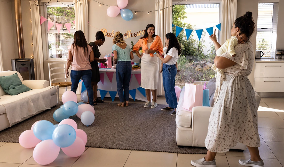
You want a gender reveal table that looks great in photos and feels easy to pull together. The right tableware sets the mood, supports your theme, and keeps the focus on the big moment.
Small choices in color, texture, and layout can make a big difference on camera. You can create a photo-ready gender reveal table by choosing tableware that fits your color theme, keeps patterns simple, and balances plates, cups, and accents without crowding the table.
Pink and blue setups bring a classic look, while neutral styles offer a soft, modern feel that works in any space. Both options can look clean and polished with the right mix of pieces.
This guide walks you through tableware basics, color-driven setups, and styling tips that help your table photograph well from every angle. You’ll also see how centerpieces, specialty plates, and simple accents work together to keep the table looking intentional—not busy.
Essentials of Gender Reveal Tableware
Well-chosen tableware sets the visual tone of your gender reveal and keeps the setup easy to manage. Color choices, materials, and practical details all affect how the table looks in photos and how smoothly the event runs.
Choosing the Right Color Palette
You shape the mood of your table with color. Pink and blue remains the most common choice, especially for clear photo cues and classic reveal moments.
Many tableware sets use soft pastels instead of bright tones to reduce glare and keep photos balanced. Neutral palettes work well if you want a modern or subtle look.
Cream, beige, sage, or gray plates pair easily with a single pink or blue accent item. This approach keeps the reveal moment focused and avoids visual clutter.
For mixed palettes, limit yourself to two main colors and one accent. This keeps plates, cups, and napkins coordinated without competing for attention.
Tableware Materials and Finishes
Material affects both appearance and performance. Disposable paper tableware works best for most gender reveals due to easy cleanup and wide design options.
Matte finishes photograph better than glossy ones, especially under indoor lighting. Plastic tableware offers more durability for outdoor events.
Choose solid colors or light textures to avoid reflections. Reusable melamine plates suit smaller gatherings and provide a cleaner, structured look.
-
Matte paper for plates and napkins to reduce shine
-
Sturdy cups that hold cold drinks without bending
-
Simple patterns that do not distract from the reveal item
Balancing Practicality and Aesthetics
You want tableware that looks good and works well under real use. Match plate sizes to your menu.
Dessert-only setups need small plates, while full meals require sturdy dinner plates. Plan quantities carefully.
Provide extra napkins and cups, especially if drinks include juice or soda. Choose table covers that resist spills and stay flat for photos.
Keep serving pieces simple and functional. Neutral trays, white serving bowls, and clear drink dispensers support the theme without overpowering it.
Pink and Blue Themes for Picture-Perfect Tables
Pink and blue tables photograph best when you balance color, spacing, and simple shapes. Clear layouts, matched tableware, and soft contrast help photos look clean and bright.
Iconic Pink and Blue Combinations
You get strong photos when you limit the palette to two main shades plus white. Use soft pink with light blue for daylight parties.
Use hot pink with navy for evening or indoor events. Popular pairings that work well on camera include:
-
Blush pink + sky blue with white plates
-
Dusty rose + pastel blue with clear cups
-
Bubblegum pink + royal blue with white napkins
Match plates, cups, and napkins, but keep flatware neutral. White or clear flatware prevents color clutter.
Add one baby-themed item per place setting, such as a small rattle or name card, to keep the table from looking busy.
Placement Ideas for Maximum Impact
You control the photo result with placement. Center the reveal item, such as a cake or covered tray, in the middle of the table.
Keep it clear on all sides. Place pink items on one side and blue on the other.
This split creates clean photos and clear meaning. Use matching plate stacks, cup rows, and napkin folds on each side.
For long tables, repeat the pattern every three to four place settings. Leave open space between items so shadows don’t overlap.
If you use balloons or signs, place them behind the table, not on it, to keep surfaces clean in photos.
Popular Pink & Blue Tablecloths
Tablecloth choice affects light and color balance. Matte fabrics reduce glare and help colors stay true in photos.
Common options include:
|
Tablecloth Type |
Best Use |
Why It Works |
|
Solid white |
Any setting |
Keeps focus on tableware |
|
Half pink / half blue |
Rectangular tables |
Creates a clear split |
|
Pink with blue runner |
Small tables |
Adds contrast without clutter |
|
Subtle pattern |
Outdoor events |
Hides wrinkles |
Choose floor-length cloths for formal photos. Use fitted cloths for casual settings.
Iron or steam before setup to avoid harsh lines in close-up shots.

Neutral and Gender-Neutral Tableware Setups
Neutral tableware keeps the focus on the celebration, not the color code. These setups photograph well, feel inclusive, and work for any reveal style, from casual gatherings to styled events.
Gold, Silver, and Pastel Alternatives
Metallics and soft pastels give you a polished look without using pink or blue. You can use gold or silver plates, flatware, or charger plates to add contrast on a white or cream table.
These finishes reflect light well, which helps photos look bright and clean. Pastel tones like sage, lavender, butter yellow, or soft peach work best when you limit the palette.
Stick to two or three colors across plates, napkins, and cups. Pair metallic accents with matte tableware for balance.
A glossy gold rim on a neutral plate adds detail without pulling attention away from the reveal moment.
Minimalist & Modern Looks
Minimalist tableware suits modern homes and small gatherings. Use solid white, beige, or light gray plates with simple shapes and no patterns.
Stoneware and porcelain both work well and feel intentional in photos. Keep place settings consistent.
Use matching plates, neutral linen napkins, and clear glassware. Avoid printed text or themed graphics, which can distract in close-up shots.
Negative space matters. Leave open areas on the table and limit centerpieces to one low arrangement or a clean balloon accent nearby.
Nature-Inspired Tableware Choices
Nature-based setups feel warm and relaxed. Choose ceramic or stoneware plates in sand, clay, or soft green tones.
These colors photograph well indoors and outdoors. Use natural textures to add depth.
Linen napkins, wooden serving boards, and woven placemats pair well with neutral tableware. Fresh flowers or simple greenery work better than bold arrangements.
Keep the reveal detail subtle. Neutral cupcakes, a simple cake topper, or a covered dish works well.
Specialty Tableware: Plates, Cups, and Utensils
The right plates, cups, and utensils shape how your table looks in photos. Color choice, finish, and scale matter, especially when guests gather close and cameras point down at the table.
Feature Pieces That Photograph Well
Choose statement plates as your anchor. Large dinner plates with soft pink and blue rims frame food cleanly and show up well in overhead shots.
Neutral sets with gold or silver edging add contrast without stealing focus. Cups matter more than you think.
Clear cups with colored rims or printed icons keep drinks visible and bright. Tall cups photograph better than short ones because they add height.
Utensils can elevate the look. Metallic plastic or bamboo sets catch light and look polished.
Many major retailers carry coordinated kits, so you can match plates, cups, and utensils without hunting. Photo-friendly finishes include:
-
Matte paper: reduces glare
-
Foil accents: add highlights
-
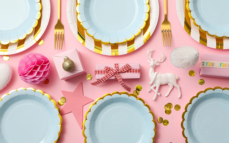
Scalloped edges: create soft lines
Mix-and-Match Looks
Mixing sets creates depth and avoids a flat color block. Pair solid plates with patterned napkins, or use neutral plates with pink and blue cups.
Stick to two or three colors. For example, use white plates, blush cups, and sky-blue utensils.
Repeating each color at least twice keeps the table intentional. You can also vary sizes.
Place dessert plates on top of dinner plates for a layered look. Add cocktail napkins under cups to break up empty space.
-
One bold item per place setting
-
Repeat colors across the table
-
Keep patterns small and simple
Eco-Friendly and Disposable Options
You can choose disposable tableware that still looks good in photos. Compostable paper plates now come in clean prints and soft colors.
They photograph like standard paper but feel more thoughtful. Bamboo or wood utensils add texture and read as neutral.
They work well with both pink/blue and gender-neutral themes. Clear compostable cups keep drink colors visible.
Many stores offer eco sets alongside standard kits. Look for labels like plant-based or compostable, and avoid waxy coatings that reflect light.
|
Option |
Look in Photos |
Cleanup |
|
Compostable paper |
Soft, low glare |
Easy |
|
Bamboo utensils |
Natural, neutral |
Easy |
|
Plastic metallic |
Bright, reflective |
Easiest |
Centerpieces and Decorative Accents
Strong centerpieces guide the look of your tables and show clearly in photos. Color balance, height, and texture matter most, especially when you mix pink, blue, or neutral tones with simple tableware.
Balloon and Floral Arrangements
Balloon and floral centerpieces give height without blocking views across the table. You can pair small balloon clusters with low flower arrangements to keep the table open.
Use matte balloons in pink, blue, white, or beige to reduce glare in photos. Fresh flowers work well, but faux stems last longer and keep colors consistent.
Choose simple blooms like roses, carnations, or baby’s breath. Clear vases photograph cleanly and reflect light without adding color.
-
1–2 balloons per centerpiece, tied low
-
Flowers no taller than 10–12 inches
-
Neutral ribbon or string for clean lines
Party shops on Etsy and major retailers often sell ready-made balloon and floral sets that match common gender reveal themes.
Creative Confetti and Table Scatter
Confetti and table scatter add those little details that really pop in close-up photos. Keep it light and controlled—too much scatter just looks messy and hides your tableware.
Try using flat paper confetti instead of metallic pieces, since metallics cause glare. Circles, stars, or even tiny question marks work well. Mix pink and blue evenly, or go for white and gold if you want a neutral vibe.
You can layer scatter with other accents, too.
-
Place confetti around place settings, not under plates.
-
Add a small clear dish with extra pieces for detail shots.
-
Match confetti colors to napkins or cups.
Amazon and Walmart usually have bulk confetti, which helps you keep colors consistent across all your tables.
Themed Cake Stands and Trays
Cake stands and trays do double duty as decor and serving pieces. Use them even if you’re serving cupcakes, cookies, or candies instead of cake. Raised stands add some height and help desserts stand out in photos.
Pick white, clear, or light wood stands so the food stays in focus. Skip busy patterns that might clash with your tableware. For gender reveal themes, simple text like “Boy or Girl?” looks better than big graphics.
Try grouping trays in threes for balance.
-
Put one cake stand at the center.
-
Place two lower trays on each side.
-
Use matching colors across all tables.
Etsy has lots of handmade options, so you can customize the text while keeping the design clean and photo-friendly.
Tips for Setting and Styling Tables to Photograph Beautifully
Clear light, balanced layouts, and personal details really make photos pop. If you plan each part with intention, your table looks clean, warm, and easy to capture on camera.
Lighting for Stunning Photos
Use natural light as much as you can. Set the table near a window and angle it so the light comes from the side, not straight on. Side light adds depth and softer shadows.
Skip harsh overhead lights—they cast strong shadows and dull the colors. If you need more light, use a small lamp with a warm bulb behind the camera.
Quick lighting tips
-
Shoot during late morning or early afternoon.
-
Turn off mixed light sources.
-
Use light-colored linens to reflect more light.
If you’re outside, put the table in open shade. Shade keeps colors true and helps everyone avoid squinting.
Arranging Tableware for Visual Interest
Balance the table without crowding it. Start with a neutral tablecloth, then layer plates, napkins, and a simple centerpiece. Keep spacing even so each item stands out.
Use color carefully. Limit pink and blue to a few things, like napkins or cups. Let white, beige, or wood tones fill the rest of the space.
Simple layout structure
|
Item |
Placement |
|
Plates |
Centered at each seat |
|
Napkins |
Folded on plates or beside forks |
|
Center pieces |
Low and spaced evenly |
Vary heights a bit, but keep center items low so guests and cameras can see across the table.
Incorporating Personalized Touches
Personal details make photos matter more. Try adding name cards, small signs, or even custom napkin rings.
Stick to clean fonts and softer colors. That way, nothing overpowers the table or looks too loud.
Pick items that actually fit your theme. Mini plants, candles, or a framed note can really pull things together.
Just make sure your choices stay put and don’t throw off the lighting with too much shine.
Ideas that photograph well
-
Handwritten place cards
-
Small keepsakes in neutral colors
-
A simple sign with the reveal date
Try not to go overboard—one or two personal touches per place setting is usually enough. That way, the table looks tidy and you don’t lose the focus.