

Choosing tableware colors shapes how your event looks and feels. When plates, glassware, and linens work together, the table feels planned instead of random.
You want clear options that save time and reduce guesswork. These 10 tableware color pairing templates give you ready-made palettes you can use right away for parties and events.
Each pairing shows how colors work together across themes, budgets, and event styles, from casual gatherings to formal settings. You’ll see how to adjust colors, extend them beyond the table, and plan sets that fit your budget without losing visual balance.
What Are Tableware Color Pairing Templates?
Tableware color pairing templates give you clear color choices for plates, bowls, glassware, and linens. They help you build a clean table look without guessing or testing endless options.
Definition and Purpose
Tableware color pairing templates are pre-set color palettes made for dining tables. Each template includes a small group of colors that work well together.
You can apply them across tableware, linens, and accents. These templates focus on balance, contrast, and tone—usually a main color, a support color, and one accent.
This structure helps you avoid clashing shades or uneven color weight. The main purpose? Speed and clarity. Choose a color scheme once and use it across the table.
This approach works well for hosts, planners, and venues that need reliable results. Common elements in a template:
● Base tableware color
● Secondary or neutral color
● Accent color for contrast
Benefits for Parties and Events
You save time when planning events with lots of details. A ready color palette removes trial and error.
Color pairing templates also keep the table consistent. Guests notice a clear visual theme across all place settings.
This consistency matters at weddings, birthdays, and corporate events. Templates also help control costs by keeping you from buying extra pieces that don’t fit the scheme.
Practical benefits include:
● Faster setup
● Fewer design mistakes
● Easier coordination with décor and flowers
How Ready-Made Palettes Work
Ready-made palettes start with a proven color relationship. Designers often use warm, cool, or neutral color schemes to guide choices.
You apply each color to a specific role. Plates might use the main color, while napkins carry the accent. Glassware and chargers usually stay neutral.
Many palettes follow simple ratios. A common rule: 60% main color, 30% secondary, and 10% accent. This ratio keeps the table calm and readable.
| Palette Role | Typical Items |
|---|---|
| Main color | Dinner plates, chargers |
| Secondary | Salad plates, bowls |
| Accent | Napkins, runners, décor |
Repeat the same color palettes across multiple tables to keep the event unified.
10 Ready-Made Tableware Color Palettes for Events
These color palettes give you ready-made options for different event styles and seasons. Each pairing focuses on balance, ease of use, and visual clarity across plates, linens, glassware, and accents.
Palette 1: Timeless Neutrals
Timeless neutrals work well when you want a clean and calm table. You can rely on these color combinations for weddings, business events, and formal dinners.
Core colors:
● White
● Soft beige
● Warm gray
● Light taupe
Use white plates as the base and layer beige or gray linens underneath. Add taupe napkins to soften the look.
Clear or lightly tinted glassware keeps the table open and bright. This color palette helps food stand out without distraction.
Small metallic touches, like silver flatware, fit in without changing the core look.
Palette 2: Modern Monochromes
Modern monochromes use contrast to create a sharp and current style. This palette suits evening events, product launches, and minimalist themes.
Core colors:
● Black,
● Charcoal gray
● Crisp white
Start with white plates to avoid a heavy look. Use black or charcoal chargers for contrast.
Black napkins create a clear focal point and guide the eye across the table. This color palette works best with simple shapes and matte finishes.
Avoid extra colors so the clean color combinations stay intentional.
Palette 3: Pastel Spring Harmony
Pastel spring harmony feels light and welcoming. You can use it for brunches, baby showers, and daytime celebrations.
Core colors:
● Blush pink
● Soft mint
● Pale lavender
● Cream
Mix pastel plates with cream linens to keep the table grounded. Rotate napkin colors to spread color evenly.
Use clear glassware to prevent visual clutter. Keep patterns subtle so the soft tones remain the focus.
These color combinations feel gentle and organized.
Palette 4: Vibrant Summer Pops
Vibrant summer pops bring energy to outdoor parties and casual events. This palette works well in natural light.
Core colors:
● Turquoise
● Coral
● Sunny yellow
● White
Use white plates to anchor the table. Add turquoise or coral napkins for contrast.
Yellow accents, like cups or small bowls, add warmth without overpowering the setup. Limit each place setting to two bright colors to keep things lively but controlled.
Palette Inspiration for Themed Parties
Strong tableware color pairings help you set the mood and guide décor choices. When you match colors to the theme, your plates, linens, and serving pieces support the story you want guests to see in photos and logos.
Elegant Weddings
Elegant weddings rely on calm, balanced colors that look clean in natural and indoor light. You want shades that feel formal without looking flat or dull.
Reliable wedding pairings:
● White + soft gold
● Ivory + sage green
● Dusty blue + warm gray
Use matte plates with a light sheen on chargers or flatware for contrast. Keep napkins one shade darker than the plate so place settings stand out in photos.
Don’t use more than three colors at the table.
Festive Holidays
Holiday parties benefit from bold color contrast and clear seasonal cues. Tableware should feel lively but still controlled.
Popular holiday combinations:
● Deep red + cream + pine green,
● Navy + silver + white,
● Burnt orange + charcoal + gold
Use darker plates for dinner and lighter ones for dessert to keep the table from feeling heavy. Mix glossy and textured finishes to add depth without extra colors.
These palettes photograph well in low light and adapt easily to branded logos on menus, gift tags, and table cards.
Children’s Celebrations
Children’s parties call for bright, simple colors that feel playful and easy to read. Limit the palette so the table doesn’t look chaotic.
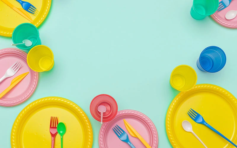
Effective kids’ color sets: Sky blue + yellow, Pink + mint green, Purple + teal
Use solid plates with one accent color for cups or napkins. Avoid patterns that clash with food colors.
Plastic or bamboo tableware works best when colors stay bold and flat. Simple palettes help party photos stay clear and fun.
How to Match Tableware Using Color Palettes
Color palettes help you make quick, clear choices when you plan a table. Keep the look balanced by picking a small set of colors and using them with intent across plates, glasses, and decor.
Step-by-Step Matching Guide
Start with one base color that fits your event. For formal dinners, choose white, navy, or charcoal.
For casual parties, try sage, sand, or soft blue. Add one or two support colors and keep contrast clear but controlled.
A color palette generator can help you test options before you buy or rent items. Tools like Coolors let you lock one color and explore matches.
Use this simple structure:
| Role | Color Type | Example |
|---|---|---|
| Base | Neutral or dark | White, stone, navy |
| Accent | Mid-tone | Olive, blush, teal |
| Highlight | Small pop | Gold, black, cobalt |
Limit your palette to three colors. This keeps the table clean and easy to style.
Combining Plates, Glasses, and Decor
Assign each color a clear job. Plates work best in the base color since they cover the most space.
Choose solid or lightly textured finishes for flexibility. Use accent colors on salad plates, bowls, or napkins for interest.
Keep patterns simple and repeat them once or twice. Reserve highlight colors for small items like glassware, chargers, or candles.
Clear glass also helps break up strong colors. Follow these rules:
● Match warm colors with warm metals
● Match cool colors with silver or clear glass
● Repeat each color at least twice
Design Tools and Templates for Customization
You can adjust tableware color pairings fast with the right tools. Palette generators help you pick colors, while docs, sheets, and presentations let you apply them to real layouts.
Top Color Palette Generators
A color palette generator gives you ready-made color sets that work well together. Lock a color you like and refresh the rest until the mix fits your event.
Popular options include:
● Coolors: Press one key to cycle palettes. Export hex codes for print and digital use.
● Paletton: Use a color wheel to build balanced pairs, like complementary or triadic sets.
● Pantone Palette Generator: Match colors to known standards for print accuracy.
Most tools let you save palettes and share links with vendors. Use these tools for fast results or when you want to test several looks before you commit.
| Feature | Why it helps |
|---|---|
| Lock colors | Keep brand colors stable |
| Export codes | Share exact values |
| Save palettes | Reuse for future events |
Editing Palettes in Docs and Sheets
Managing color choices in docs and sheets keeps teams on the same page. Try making a simple table with color names, hex codes, and a quick note for how to use each one.
In docs, add colors to table labels, menu headers, and seating cards. In sheets, track color use for things like plates, linens, and signage. Use cell fills to preview pairings fast.
This makes it easier for planners who share files with clients or vendors. Changes stay obvious, and setup mistakes drop way down. Short files are better. Stick to one page per event to keep things simple.
Using Templates for Presentations
Templates help you show off color pairings in presentations and infographics. Pick slides with editable shapes so swapping colors is quick.
Use templates for:
● Event mood boards
● Table setting mockups
● Vendor briefs
Apply your palette to slide backgrounds, icons, and charts. Keep text either dark or light neutral for easy reading.
Most presentation tools let you save a theme, so new slides all match. It saves time and gives your event plans a polished, clean vibe.
Branding and Event Marketing Applications
Tableware color pairing templates help you build consistent marketing across every event detail. When your printed and physical materials match the table settings, your brand feels intentional and professional.
Integrating Palettes on Business Cards
Try matching your business cards to the same colors you use on plates, linens, or napkins. This little detail helps guests connect your brand to the event itself.
Use one main color for the background and an accent for things like your name or logo. High-contrast text works best, especially in weird lighting.
Best practices for business cards:
● Choose card stock finish based on event style (matte for formal, gloss for casual).
● Stick to two or three colors max.
● Repeat an accent color from tableware trims or chargers.
Brochures and Banners with Cohesive Colors
Brochures and banners look best when they match your tableware palette exactly. Use the same color codes in print files to avoid weird mismatches.
Put darker tones on headings and lighter ones on backgrounds. This makes layouts easy to read, even from across the room.
| Element | Recommended Color |
|---|---|
| Headings | Primary color |
| Background | Neutral or light secondary |
| Highlights | Accent color |
When banners sit near tables, matching colors help guests move naturally through the space.
Labels, Stickers, and Promotional Materials
Labels and stickers are small but powerful branding tools. Match them to the colors on cups, favor boxes, or packaging.
Stick with solid color backgrounds for small items. It keeps the text sharp and readable.
Smart uses for matching labels:
● Food labels that match plate or tray colors
● Stickers repeating napkin or runner accents
● Promotional materials echoing charger or glassware tones
Extending Palettes Beyond Tableware
Reusing your tableware palettes across event materials keeps everything looking unified. When you carry colors into print and digital items, guests spot the event theme faster and find their way around with less effort.
Calendars, Resumes, and Event Materials
You can use the same palette for calendars, resumes, and printed event items without much extra work. Assign clear roles to each color so things stay readable.
| Use | Color Choice | Purpose |
|---|---|---|
| Headers | Dark or bold tone | Clear structure |
| Body text | Neutral shade | Easy reading |
| Dates or highlights | Accent color | Quick scanning |
Use light backgrounds for calendars so dates pop out. On resumes for event staff or vendors, keep contrast high and use accents just for section titles.
For menus, place cards, and signage, reuse the same two or three colors so things don’t get cluttered.
Memes and Social Event Graphics
Bring your palettes into memes, photo collage posts, and social graphics to promote the event. Pick one background color and one accent to frame photos or text.
Keep text colors bold and simple so they’re readable, even on a phone screen. Use the accent color for borders, icons, or emojis to tie posts back to the tableware.
When you build a photo collage, try the same color border on each image for a clean look. This little bit of consistency helps guests connect online posts with the actual event—no need for extra explanation.
Tips for Budgeting and Pricing Tableware Sets
You can control tableware costs and still make your event look great. Clear pricing plans and smart buying help you match colors without blowing the budget.
Estimating Costs for Parties
Start with a headcount and the meal style. Seated dinners need more pieces than buffets, so costs add up fast. Focus on price per guest. It keeps totals easy to track and lets you adjust early if needed.
| Item | Typical Range (per guest) |
|---|---|
| Plates and bowls | $2–$6 |
| Flatware | $1–$3 |
| Glassware | $1–$4 |
Add a 10–15% buffer for breakage or last-minute guests. That step saves you from surprise costs later. Pick one “feature” color or finish, like gold rims or deep blue plates. Keep the rest neutral so you don’t pay premium prices for every single piece.
Finding Affordable Stylish Solutions
Mix solid colors with one patterned piece. That way, you can follow color pairing templates without blowing your budget.
Try searching for bundled sets instead of picking out every item individually. Sets usually cut the per-item price and honestly, they make planning a whole lot easier.
Here are a few cost-saving ideas:
● Disposable premium-look tableware works well for big gatherings.
● Secondhand or rental items can cover things like chargers or serving trays.
● Standard white bases mixed with colored napkins or cups keep things simple but not boring.
Steer clear of trendy colors that you’ll only use once. Neutral bases with flexible accent colors stretch your dollar over more events, which just makes sense if you ask me.