

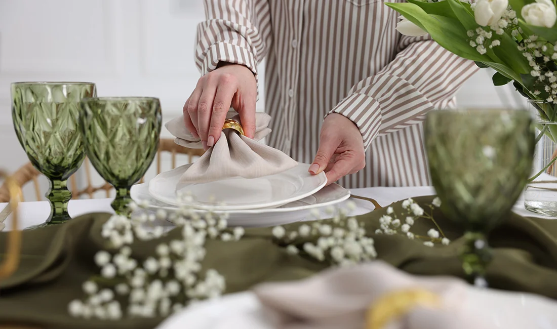
Every host has faced this moment: the plates look great, the cups are ready, and then the napkins land on the table — and something feels off. That single mismatched element can quietly downgrade the entire setup. The good news is that napkin-to-tableware color matching is not about having a design background. It comes down to a handful of repeatable principles that work across every occasion, from a casual backyard barbecue to a formal wedding reception.
Some hosts default to matching everything in the same exact shade. It feels safe, but the result is often flat and forgettable. A more intentional approach — using thoughtful contrast, balanced intensity, and one or two accent pieces — is what separates a table that looks “fine” from one that feels truly styled. The rules below apply whether the table features heirloom china or premium disposable tableware designed to look just as elegant.
Why Does Napkin Color Change the Entire Table?
Napkins sit at the center of each place setting and often carry the most visible color on the table. Because plates tend toward neutral finishes, the napkin functions as the primary accent piece that defines the table’s overall mood and color direction.
Unlike plates or cups, a napkin serves double duty — it is both a practical item and a decorative one. It can be folded into shapes, fanned across a plate, or gathered with a ring. That versatility gives it visual weight far beyond its physical size. When a host chooses a coral or gold napkin, the table feels warm and energetic. When the choice shifts to sage or ice blue, the atmosphere becomes calm and sophisticated. Color psychology is doing quiet work at every meal, and the napkin is the element carrying most of that weight.
This matters even more in setups that use plates in white, clear, or gold-rimmed finishes. These neutral bases are designed to let whatever sits on top of them — especially the napkin — set the tone.
How Do Warm and Cool Tones Set Different Moods at the Table?
Warm tones like red, coral, mustard, and gold stimulate appetite and create a sense of energy — ideal for celebrations, holiday dinners, and lively gatherings. Cool tones like navy, sage, lavender, and silver bring a sense of calm and formality, making them natural choices for weddings, corporate dinners, and intimate evenings. A host who understands this warm-cool divide already has a powerful shortcut for choosing the right napkin color before considering any other factor.
Do Matching Napkins and Plates Actually Look Better in Photos?
Surprisingly, no. When napkins and plates share the exact same color, the napkins tend to disappear in photographs. Event photographers consistently find that a visible contrast between the napkin and the plate — even a subtle one — produces more visually interesting images. For anyone hosting an event where photos matter, choosing a napkin that stands apart from the plate by at least two shades ensures the table setting translates well on camera.
What Color Combinations Work Between Napkins and Plates?
Four color relationships cover nearly every pairing: complementary colors create bold contrast, analogous colors produce smooth harmony, monochromatic tones add layered depth, and a neutral base with one accent color offers the most versatile, low-risk starting point for any event.
Understanding these four relationships removes the guesswork. A host does not need to memorize the entire color wheel — just the basic logic behind each pairing style.
What Is the Difference Between Complementary and Analogous Pairings?
Complementary colors sit opposite each other on the color wheel. Navy and burnt orange, for example, create a high-contrast pairing that feels bold and energetic. Analogous colors sit side by side — think blush plates with peach napkins and dusty rose cups. The effect is gentler, more flowing, and inherently harmonious. Complementary pairings suit festive, high-energy events; analogous pairings suit romantic or refined settings where subtlety is the goal.
When Does a Monochromatic Setup Work — and When Does It Fall Flat?
A monochromatic palette uses different shades of the same hue — ivory plates, champagne napkins, and cream candles, for instance. Done well, it creates elegant depth. Done poorly — when every element is the exact same shade — it reads as flat and unintentional. The key distinction is tonal variation. A successful monochromatic table needs at least three clearly different shades of the same color family so the eye can distinguish each layer.
How Does Texture Affect the Way Two Colors Look Together?
Two items in the “same” ivory can look noticeably different if one has a matte paper finish and the other a glossy plastic surface. Light reflects differently off each texture, creating a perceived color gap. This hidden variable matters especially in disposable tableware setups, where paper napkins sit beside plastic plates and acrylic stemware. Hosts can bridge the texture gap by introducing a third surface finish — metallic cutlery or crystal-style champagne flutes and wine glasses that add a reflective layer and visually unify the mix.
What Are the Easiest Rules for Matching Napkins to Tableware?
Start by choosing the plate first since it occupies the largest color area. Then match color intensity rather than exact shade, apply the 60-30-10 proportion across the table, limit bold elements to one item, and use metallics to bridge any gaps.
These five principles work independently, but they compound when used together. A host who follows even two or three of them will produce a more cohesive table than one who selects items at random.
Should the Plate or the Napkin Be Chosen First?
Always the plate. It is the largest color field on the table and anchors the entire palette. Once the plate color is set, the napkin’s job is to complement or accent it — not compete. White, clear, and gold-rimmed plates are the most versatile starting points because they function as a neutral canvas that pairs with virtually any napkin color.
Why Should Color Intensity Stay Consistent Across the Table?
Pairing a pastel baby blue napkin with a deep burgundy plate creates an uncomfortable visual imbalance — the intensity levels are mismatched. The fix is simple: pair pastels with pastels, jewel tones with jewel tones, and earth tones with earth tones. This one rule eliminates most “it just looks wrong” situations. For reference, the safest neutral bases include white, ivory, black, cream, beige, navy, gray, and clear.
How Does the 60-30-10 Rule Apply to a Place Setting?
Borrowed from interior design, the 60-30-10 proportion gives every element a clear role. Sixty percent of visible color comes from the dominant surface — the table itself plus the plates. Thirty percent comes from the secondary layer — napkins and cups. The final ten percent is the accent — cutlery, candles, or a centerpiece. This framework prevents visual chaos by ensuring no single layer overwhelms the others.
Can Patterns on Plates and Napkins Be Mixed Without Clashing?
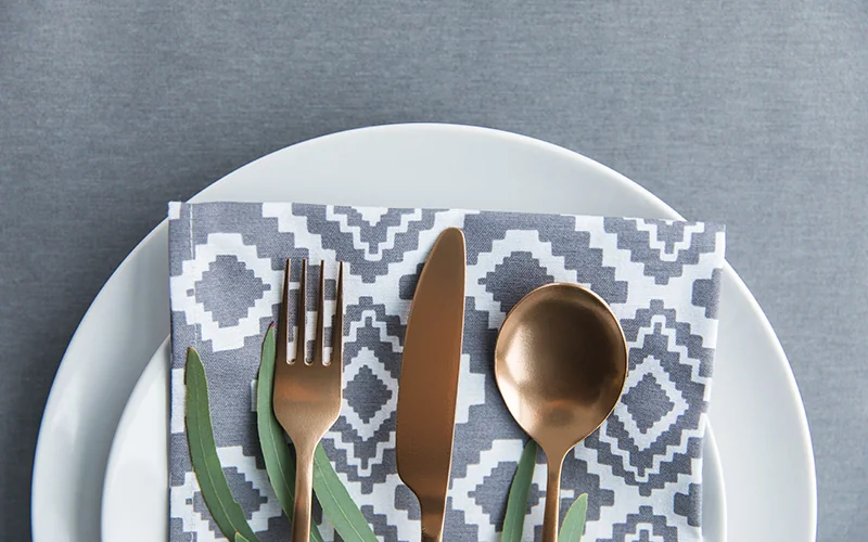
Yes, but only if one pattern is bold and the other is subtle — or one is patterned and the other is solid. Two large-scale, competing patterns on the same place setting create visual noise. If a plate has a decorative rim or embossed edge, that already counts as a pattern; the napkin should remain solid in a shade pulled from the plate’s design. If the plates are plain, a printed or textured napkin can serve as the statement piece.
When Is a Metallic or Neutral Accent the Safest Choice?
When a host is uncertain about a pairing, metallics solve the problem. Gold, silver, and rose gold function as universal “color bridges” that tie different hues together without introducing a new competing color. White napkins with gold-rimmed plates is timeless. Black napkins with clear stemware and silver cutlery is effortlessly modern. And if the napkin and plate do not quite match, a metallic napkin ring in a bridging tone visually connects them — accessories can forgive an imperfect color pairing.
What Are Common Mistakes That Make a Table Look Mismatched?
The most frequent errors are using a single color for every element, pairing mismatched intensities, combining two bold patterns, ignoring the table surface as a color, and clashing warm and cool tones without intentional contrast to balance them.
What Happens When Every Element Is the Same Color?
The table looks flat. An all-white setup with white napkins on a white tablecloth next to white plates produces zero visual depth — and as noted earlier, it photographs poorly. The fix is not dramatic: a single contrasting or metallic element is enough to break the monotony and create dimension.
Why Do Some Color Combos Clash Even When They “Should” Work?
Usually because of a warm-cool conflict or an intensity mismatch. A lemon-yellow napkin next to an icy blue plate creates tension because one is warm and the other is cool without enough intentional contrast to make it look deliberate. Staying within the same color temperature zone — or committing fully to a complementary pairing — resolves this. Another overlooked cause: ignoring the table surface. A dark wooden table, a marble counter, or a patterned tablecloth is already contributing color. Choosing napkins and plates without factoring in the surface underneath them leads to unintended clashes.
Can Napkin Rings or Accessories Fix an Imperfect Color Pairing?
They can. A napkin ring in gold, silver, or a shared accent tone acts as a visual connector between a napkin and plate that do not perfectly align. It signals intentional design even when the color match is not exact. Small accessories — a sprig of greenery, a ribbon, a place card in a coordinating color — serve the same bridging function.
Which Napkin-and-Plate Combinations Suit Specific Occasions?
Weddings favor ivory, blush, or sage napkins against neutral plates with metallic accents. Birthday tables thrive on bold primaries or monochrome metallics. Holiday settings follow seasonal palettes — warm earth tones for autumn, jewel tones or icy silvers for winter gatherings.
What Tones Work Best for Weddings and Formal Events?
Classic wedding tables pair ivory napkins with clear champagne flutes and gold-rimmed plates for timeless elegance. Modern romantic setups use dusty sage napkins against blush plates with gold cutlery. For large receptions, alternating two or three napkin colors within the same palette — sage, eucalyptus, and ivory, for instance — across different tables creates visual variety while keeping the room cohesive. Corporate dinners and formal events follow a similar logic: neutral plates, a single refined napkin color such as navy, charcoal, or white, and metallic flatware.
How Should Colors Be Chosen for Birthdays, Showers, and Kids’ Parties?
For children’s birthdays, primary-color napkins against white plates deliver instant energy with minimal effort. Milestone celebrations such as a 30th or 50th work well in monochromatic black and gold or silver and navy. Baby showers and bridal showers lean into soft pastels — mint, lavender, baby pink — paired with white or cream plates. Adding one metallic touch, such as gold cutlery, lifts the palette from simply sweet to intentionally styled. A practical advantage of disposable tableware here is that coordinated sets come in pre-matched color families, making full-table coordination easy. One neutral plate set paired with rotating napkin colors produces a different look for every occasion — a single investment that stretches across seasons. For more on choosing the right cup size to complete the set, the Paper Cups Size Guide covers the details.
What Seasonal Palettes Work for Holiday Tables?
Thanksgiving calls for warm earth tones — burnt orange, burgundy, and mustard napkins with ivory plates. Christmas offers two paths: classic red and green with gold accents, or a modern icy blue and silver for a winter-wonderland table. Halloween pairs black with orange, or purple with green for a playful twist. New Year’s Eve shines with black and gold or silver and white for a minimalist celebration. Summer gatherings, including July 4th barbecues, use bold red-white-blue with clear cups and white plates as the neutral base.
How Can a Host Preview and Test the Color Scheme Before the Event?
Place one plate, one napkin, one cup, and one piece of cutlery on the actual table surface that will be used. Photograph the arrangement from above under the event’s real lighting to confirm whether contrast and harmony translate from plan to reality.
What Is the Flat-Lay Test and Why Does It Work?
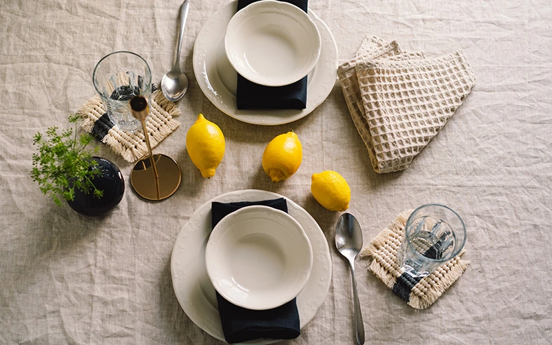
The flat-lay test is simple: arrange one of each tableware item on the table and take a photo from directly above. If the combination looks cohesive on a phone screen, it will look great in person. If one element visually “screams,” it is too dominant and should be swapped for something more muted. This five-minute test prevents hours of regret. For anyone browsing options online, the product photos on Wonderful Party’s collection pages show true-to-life colors that make pre-event planning easier.
Does Lighting Change How Colors Look Together?
Dramatically. A napkin that looks soft blush under daylight can shift to peach or even salmon under warm indoor bulbs. Testing the final setup under the same lighting the event will use — not just under kitchen fluorescents — is essential. The same combination can feel completely different at an outdoor afternoon brunch versus an indoor candlelit dinner.
FAQs
What Size Disposable Tablecloth Fits a 6-Foot Table?
A 54 × 108 inch tablecloth provides approximately 12 inches of drop on the sides and 18 inches on the ends. This pairing is the most popular for casual to semi-formal events and is the single most widely sold disposable tablecloth size.
What Is the Most Common Disposable Tablecloth Size Sold?
The two dominant standard sizes are 54 × 108 inches for rectangular tables and 84 inches round for round tables. Together, these two sizes cover the vast majority of standard party and banquet tables.
Can a Rectangular Tablecloth Be Used on a Round Table?
Using a rectangular tablecloth on a round table is not recommended. The overhang will be uneven on all sides, creating a messy, lopsided appearance. A round or square tablecloth produces balanced, even coverage on round tables.