

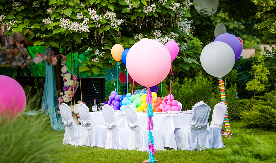
A party color theme guide helps you choose a clear color palette that shapes your tableware, decor, food, and guest attire into one coordinated look. You create a strong party color theme by selecting two or three main colors and one accent color, then using them consistently across decorations, table settings, and invitations. This focused approach sets the mood and keeps your event from looking scattered.
This guide shows you why a strong party color theme matters, how to choose the right color palette for your party style, and which popular color theme ideas work best for birthdays, weddings, and seasonal events. You will also get clear answers to common questions so you can plan with confidence.
Why a Strong Party Color Theme Matters for Tableware and Decor?
A strong party color theme gives your tableware and decor a clear direction. When you choose a defined color palette—such as navy and white or blush, gold, and cream—you limit random choices and create a coordinated look.
This matters because tableware covers large surfaces. Plates, napkins, tablecloths, and cups often sit at the center of photos. When these items share the same 2–3 colors, your setup looks planned instead of mixed.
Color consistency works in three key areas:
-
Table settings: Matching plates, chargers, and napkins create visual order. For example, white porcelain plates with a gold rim (EAV: metallic rim detail) reflect light. In practice, this adds brightness under indoor lighting.
-
Decor accents: Balloons, floral arrangements, and candles in the same palette connect the table to the room. If you repeat one accent color—like deep green—in both centerpieces and place cards, guests notice the link.
-
Food and drink presentation: You do not need color-matched meals. Instead, use tinted glassware or colored cocktail napkins to carry the theme without changing the menu.
A defined party color theme also speeds up decisions. When you shop for linens, favor items in your chosen shades. Because you filter by color first, you avoid buying decor that clashes with your table setting.
What are the Psychology of Party Colors?
|
Color |
Emotional Effect |
Why It Creates This Effect |
Practical Use in a Party Color Theme Guide |
|
Red |
Energy, urgency, passion |
Red has a short light wavelength that draws quick visual attention, which increases alertness. |
Use for dance floors, product launches, or bold accents where you want action. |
|
Blue |
Calm, trust, stability |
Blue’s longer wavelength feels steady to the eye, which reduces visual tension. |
Choose for corporate events or formal dinners to support focus and trust. |
|
Yellow |
Cheerfulness, warmth |
Yellow reflects high levels of light, which the brain links to sunlight and optimism. |
Add to daytime parties or spring themes to brighten the mood. |
|
Green |
Balance, growth, relaxation |
Green sits in the center of the color spectrum, which makes it easy for the eye to process. |
Use for garden parties or wellness events to create a grounded feel. |
|
Purple |
Luxury, creativity |
Purple was once rare in natural dyes, which built strong ties to status and wealth. |
Apply in upscale galas or artistic themes for a refined look. |
|
Orange |
Enthusiasm, social energy |
Orange blends red’s intensity with yellow’s brightness, which creates active warmth. |
Feature in birthday parties or casual gatherings to spark conversation. |
|
Pink |
Romance, softness |
Pink tones reduce visual intensity compared to red, which softens emotional impact. |
Use for bridal showers or baby celebrations. |
|
Black |
Formality, authority |
Black absorbs light fully, which creates sharp contrast and visual control. |
Pair with metallics for evening or black-tie events. |
|
White |
Cleanliness, clarity |
White reflects nearly all light, which signals order and openness. |
Use as a base color to balance bold party color themes. |
How to Choose the Right Color Palette for Your Party Style?
Choose a color palette that fits your event type, menu, venue, and lighting. When your party colors match these factors, your décor, food, and space work together instead of competing for attention.
Matching Colors to Event Type
Start with the purpose of the event. A child’s birthday, a wedding shower, and a corporate dinner each call for different color party themes.
For example:
-
Kids’ birthday: bright tones like red, yellow, and blue create energy because high-saturation colors draw attention and feel playful.
-
Formal dinner or gala: navy, black, or deep green paired with metallic gold or silver creates contrast without looking busy.
-
Beach or outdoor brunch: blue and white reflect the sky and water, so the setting feels connected to the décor.
Coordinating Food and Drinks
Your food does not need to match your color palette exactly, but it should not clash with it.
Start with items that naturally come in your party colors. Fruit, frosting, macarons, candy, and signature drinks work well because you can control their color. For example, if your palette includes pink and white, you can serve strawberry cupcakes with white icing and a clear lemonade with pink garnish.
Avoid forcing color onto main dishes. Blue-dyed chicken or neon pasta distracts from the meal. Instead, use:
-
Colored napkins
-
Glassware with tinted stems
-
Garnishes like herbs, citrus slices, or edible flowers
If you use a colored ice cube or syrup in a drink, choose food-safe dye and test it first. This step prevents uneven color or staining. For guests, this means the drink looks polished instead of messy.
Considering Venue Lighting and Space
Lighting changes how your color palette appears. Warm indoor bulbs (around 2700K–3000K) add a yellow tone. Cool LED lights (4000K and above) make colors look sharper and slightly blue.
Test your party colors in the actual space if possible. A soft blush may look beige under warm lights. A pale gray may look blue under cool lighting. In practice, this testing helps you avoid printing invitations or buying linens that look different on event day.
Also consider space size:
-
Small rooms: light shades like cream, soft blue, or pale green reflect more light. This makes the room feel open.
-
Large halls: deeper colors like burgundy or navy create focus because dark tones absorb light and define zones.
If the venue already has strong carpet or wall colors, treat them as part of your color party theme. Work with them instead of fighting them.
Balancing Bold and Neutral Tones
Every strong color palette needs balance. Bold shades attract attention because they have high saturation. Neutrals like white, beige, gray, or clear glass reduce visual noise.
Use this structure:
|
Role |
Example |
Purpose |
|
Main Color |
Emerald green |
Sets the theme |
|
Accent Color |
Gold |
Adds contrast |
|
Neutral |
White or clear |
Creates breathing room |
If you cover every surface in bold color, the room feels crowded. When you place bold tones on key items—table runners, balloons, floral arrangements—and keep plates, chairs, and large linens neutral, the eye has space to rest.
Metallics like gold or silver also act as flexible accents. They reflect light, which adds brightness without introducing a new color. For you, this means you can refresh future events by swapping one accent shade while keeping the same neutral base pieces.
What are Popular Party Color Theme Ideas for Different Occasions?
You can match your color palette to the type of event you are hosting. The right party colors help you set a clear tone, guide décor choices, and create a consistent look across invitations, food, and attire.
Elegant and Formal Color Combinations
Formal events rely on controlled, limited color party themes. You usually choose two main colors and one accent color, because a tight palette keeps the room from looking busy and distracts less from formal attire.
Colors below are suitable:
-
Navy blue and gold – Navy acts as a dark base, while metallic gold adds contrast. Because gold reflects light, it highlights centerpieces and table settings. In practice, this means you can use navy tablecloths with gold-rimmed plates or flatware to create a clear focal point.
-
Black and white with silver accents – Black defines the space, white keeps it balanced, and silver adds shine.
-
Deep red and silver – Red adds richness, while silver cools the tone so it does not feel overwhelming.
These party colors work well for weddings, galas, and milestone anniversaries. You should repeat the same shades in napkins, floral arrangements, and printed materials so your event feels unified.
Fun and Bright Themes for Celebrations
Birthday parties, graduations, and casual gatherings often use bold color palettes. Bright party colors increase visual energy because high-saturation hues stand out in photos and decorations.
Colors below are suitable:
-
Primary colors (red, blue, yellow) – These shades create strong contrast. For a child’s party, this means balloons, cakes, and banners all stand out clearly.
-
Neon pink, lime green, and electric blue – Neon pigments reflect more light under indoor lighting. In other words, they look vivid in photos and glow under blacklight.
-
Rainbow themes – You assign each table or food station a different color. This structure prevents the space from looking random.
You can also host a single-color party, such as an all-white or all-purple event. When guests wear the assigned color, your photos show a clear and coordinated theme.
Seasonal and Holiday-Inspired Palettes
Seasonal color party themes follow natural and cultural cues. Because people already link certain shades to specific times of year, these palettes feel familiar and easy to recognize.
Use different colors for different seasons:
-
Spring: Pastels like blush pink, mint green, and lavender. These lighter tones reflect more light, which suits daytime events and outdoor gardens.
-
Summer: Bright yellow, turquoise, and coral. These colors mirror sunlight and tropical settings, so they fit pool parties and barbecues.
-
Fall: Burnt orange, mustard yellow, and deep brown. Earth tones match autumn leaves, which helps outdoor décor blend with the setting.
-
Winter and Holidays: Red and green for Christmas, blue and silver for winter events, and black and orange for Halloween.
When you align your color palette with the season, you reduce guesswork in décor choices and create a theme that guests understand at a glance.
FAQs
How do I choose the right color theme for a wedding party?
Start with the setting and season. Outdoor spring weddings often suit soft tones like blush, sage, or dusty blue because natural light makes lighter colors appear brighter in photos.
Consider the venue’s existing colors. Fixed elements such as carpets or wall tones should guide your palette so everything looks coordinated.
Limit your scheme to two or three main colors plus one neutral. Neutrals like ivory, champagne, or gray help balance brighter shades and work well for linens.
When possible, choose colors with personal meaning, such as favorite flowers, cultural traditions, or shared memories, to make the theme feel intentional.
Which color themes are best for a summer party?
Light, bright colors work best because they reflect sunlight and feel visually cool. Popular choices include white, aqua, coral, yellow, and turquoise.
For beach parties, blue and white create a clean, airy look that matches the setting. For backyard barbecues, red, navy, and white are classic and highly visible outdoors. Tropical palettes like hot pink, lime, and orange also work well because they echo summer flowers and fruits.
Color theme dress code guidelines for parties
Give clear, specific instructions with both colors and formality, such as “all-white cocktail attire” or “black and gold semi-formal.”
For single-color themes, ask for solid colors to keep photos consistent. For two-color themes, require guests to wear at least one of the colors to allow flexibility.
Avoid vague terms like “festive.” Instead, provide simple examples so guests can plan outfits easily.